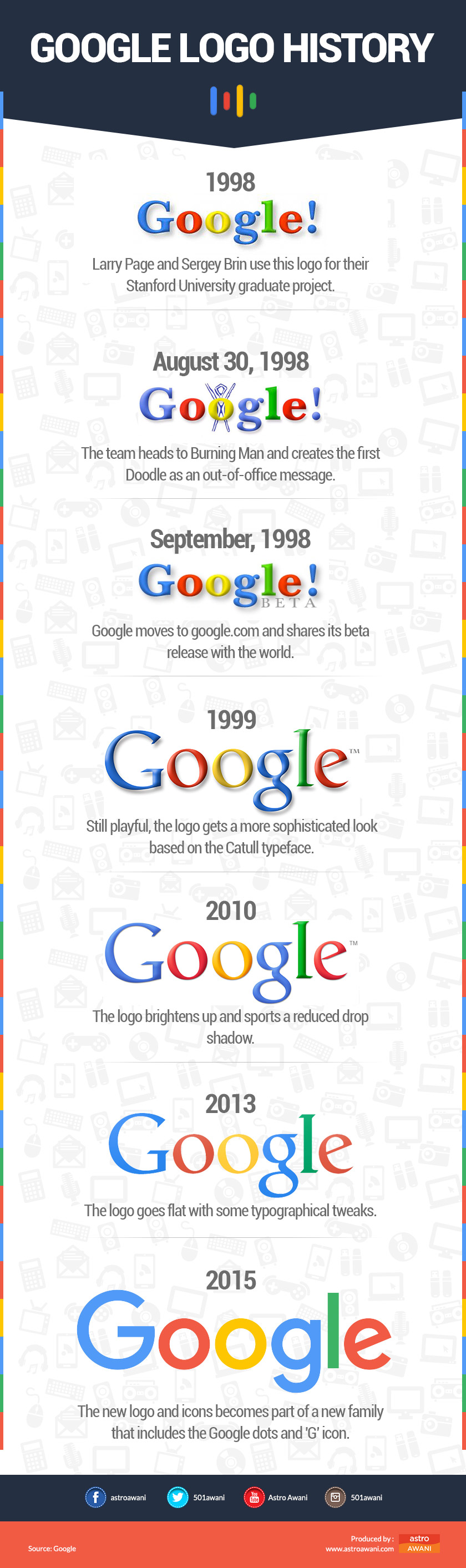
GOOGLE on Tuesday refreshed its logo to better suit mobile devices that are supplanting desktop computers when it comes to modern Internet lifestyles, according to a report by AFP.
Google's logo keeps its four-colour scheme but shifts to a soft sans-serif font.
The company is also replacing the well-known blue lower case "g" icon with an upper-case "G" combining blue, green, red and yellow.
Below is the evolution of Google logo since its inception:
Google's logo keeps its four-colour scheme but shifts to a soft sans-serif font.
The company is also replacing the well-known blue lower case "g" icon with an upper-case "G" combining blue, green, red and yellow.
Below is the evolution of Google logo since its inception:
Advertisement